The Power of UX: 5 Design Tweaks To Boost Your Website Conversions

When it comes to website design, user experience (UX) is more than just a buzzword—it’s the secret sauce that turns casual visitors into loyal customers. Great UX ensures your website isn’t just functional but also delightful to use. Even small, intentional tweaks can make a big difference. Here are five straightforward changes you can make to enhance your website’s UX and boost your conversion rates.
1. Optimize Your Navigation
Your website’s navigation is like a roadmap for your visitors. If it’s cluttered or confusing, users may get frustrated and leave before they find what they’re looking for. To improve UX:
- Simplify your menu to include only the most important links.
- Use clear, descriptive labels like “About Us” instead of vague ones like “Learn More.”
- Add a search bar for quick access to specific content.
Streamlined navigation helps visitors find what they need quickly, increasing the likelihood they’ll stay and engage with your site.
2. Prioritize Mobile Responsiveness
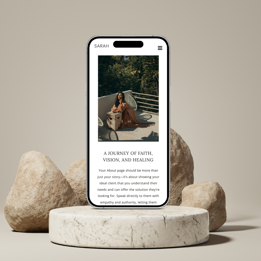
Did you know over half of all web traffic comes from mobile devices? If your website isn’t mobile-friendly, you’re likely missing out on a significant audience. To enhance UX on mobile:
- Use responsive design so your website adjusts seamlessly to different screen sizes.
- Ensure buttons and links are easy to tap.
- Simplify mobile navigation with a hamburger menu or sticky header.
A mobile-optimized site keeps visitors engaged, no matter how they’re accessing your content.

3. Speed Up Your Site
A slow website can drive users away faster than anything else. Research shows that even a one-second delay can lead to a 7% drop in conversions. To speed up your site:
- Compress images and files to reduce load times.
- Minimize the use of unnecessary plugins or scripts.
- Use a reliable hosting service that prioritizes performance.
Faster loading times create a smoother, more enjoyable experience for your visitors, keeping them on your site longer.
4. Use Visual Hierarchy to Guide Users
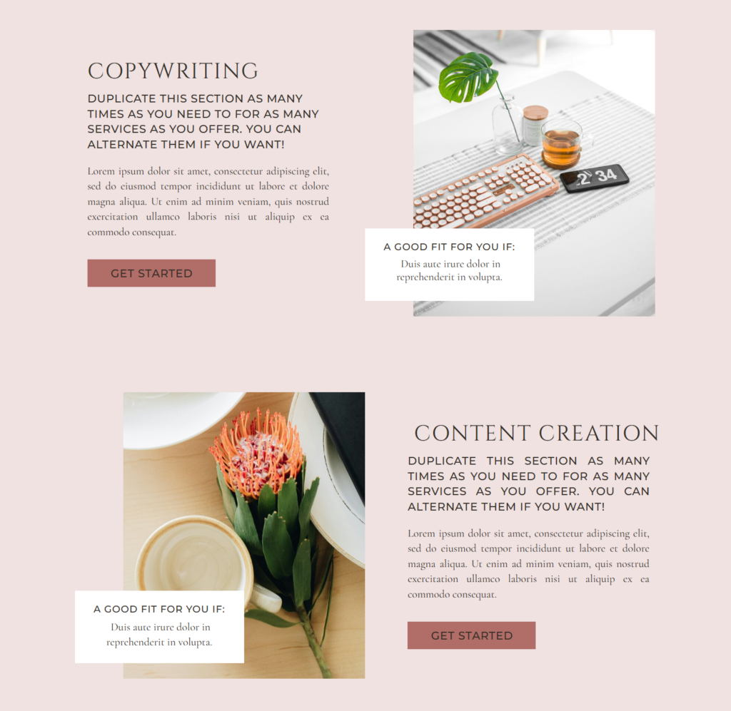
Visual hierarchy is the arrangement of design elements to direct attention. By strategically placing content, you can subtly guide users to take desired actions. For example:
- Use larger, bold fonts for headings to highlight key messages.
- Implement contrasting colors for call-to-action (CTA) buttons to make them stand out.
- Place important information “above the fold,” where users can see it without scrolling.
Effective visual hierarchy ensures visitors immediately know where to focus, reducing decision fatigue and improving conversions.

5. Simplify Your Forms
Whether it’s a contact form or a checkout page, overly complex forms can deter users. Simplify your forms by:
- Asking only for essential information (e.g., name, email).
- Using auto-fill options for faster input.
- Breaking longer forms into multi-step processes to make them feel less daunting.
User-friendly forms make it easier for visitors to take action, increasing the likelihood of completing conversions.
Final Thoughts
Improving UX doesn’t always mean a complete redesign. Sometimes, small, strategic tweaks can make all the difference. By optimizing navigation, prioritizing mobile responsiveness, speeding up your site, leveraging visual hierarchy, and simplifying forms, you can create a website that’s not only functional but also a joy to use. The result? Happier visitors, higher engagement, and more conversions.
Ready to take your website to the next level? Start small, but think big—the power of UX is in your hands!