5 Website Design Layouts That Convert Visitors into Customers
Your website isn’t just a digital storefront—it’s a ministry, a message, and a mission.
When done right, it can guide visitors toward the transformation you offer, help them trust your brand, and inspire them to take action—whether that’s purchasing your product, booking your services, or joining your community.
So, how do you create a website that not only looks beautiful but actually converts? It starts with the right layout.
Let’s dive into five website design layouts that will help you turn curious visitors into loyal customers!
1. The Classic Hero Layout
Think of the Hero Layout as rolling out the red carpet for your visitors. It features a bold, full-width image or video, paired with a powerful headline and a clear call-to-action (CTA) right at the top of your homepage.
Why it works: This layout makes a strong first impression, drawing visitors in immediately. It’s perfect for highlighting your main offer or core message, creating an instant emotional connection.
Pro tip: Keep it clean and focused. Within seconds, visitors should know who you are, what you offer, and how to take the next step.

2. The Z-Pattern Layout
Our eyes naturally scan a page in the shape of a “Z”—starting at the top left, moving across to the right, then diagonally down to the bottom left, and across again. The Z-Pattern Layout follows this flow, guiding visitors seamlessly through your content.
Why it works: It strategically places the most important elements—your logo, headline, key benefits, and CTA—right where visitors’ eyes will naturally land.
Pro tip: Use bold typography and contrasting colors to emphasize key touchpoints along the Z-pattern, ensuring that nothing important gets overlooked.

3. The F-Pattern Layout
If your website is content-heavy—like a blog or resource hub—the F-Pattern Layout is a game-changer. It mirrors how we naturally read and scan information: left to right, top to bottom.
Why it works: This layout prioritizes readability and user experience, ensuring that visitors absorb your most valuable content first.
Pro tip: Break up your text with headings, bullet points, and images. Since visitors are likely skimming, make it effortless for them to find what matters most.
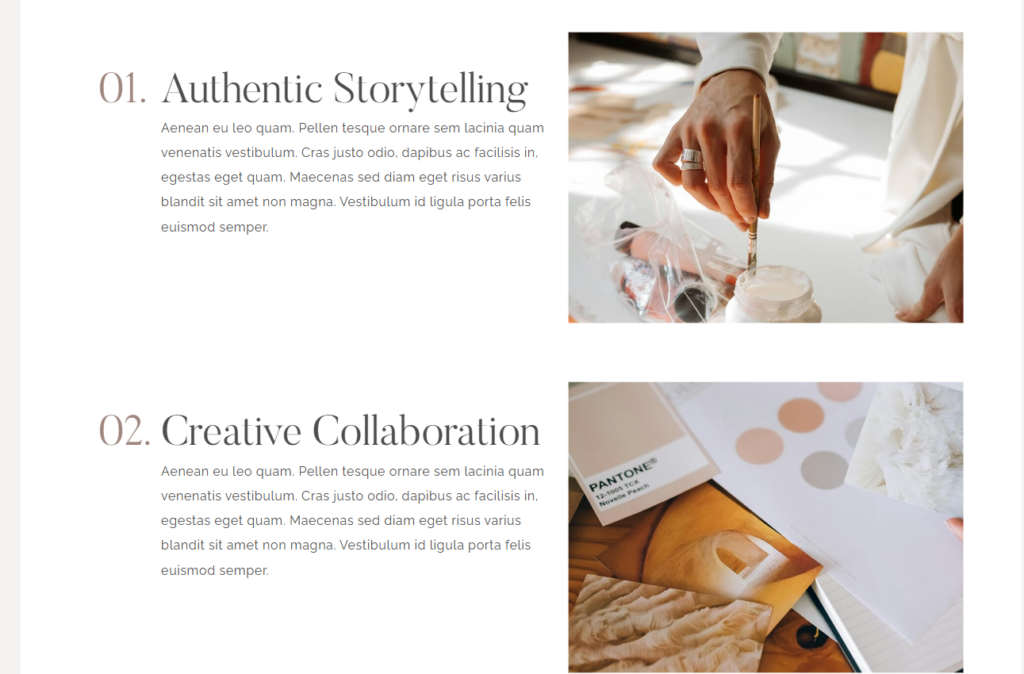
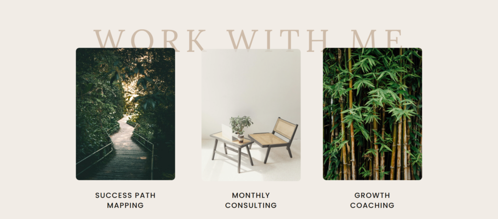
4. The Card-Based Layout
Imagine neatly arranged “cards” on your screen—each featuring an image, headline, and short description. That’s the Card-Based Layout, a visually engaging way to present multiple products, blog posts, or services in a clean, organized format.
Why it works: This layout allows for quick scanning, making it easy for visitors to browse and click on what interests them most. It’s perfect for e-commerce sites, online courses, or content-rich platforms.
Pro tip: Make each card clickable, leading to detailed landing pages. This keeps visitors engaged and encourages deeper exploration of your brand.
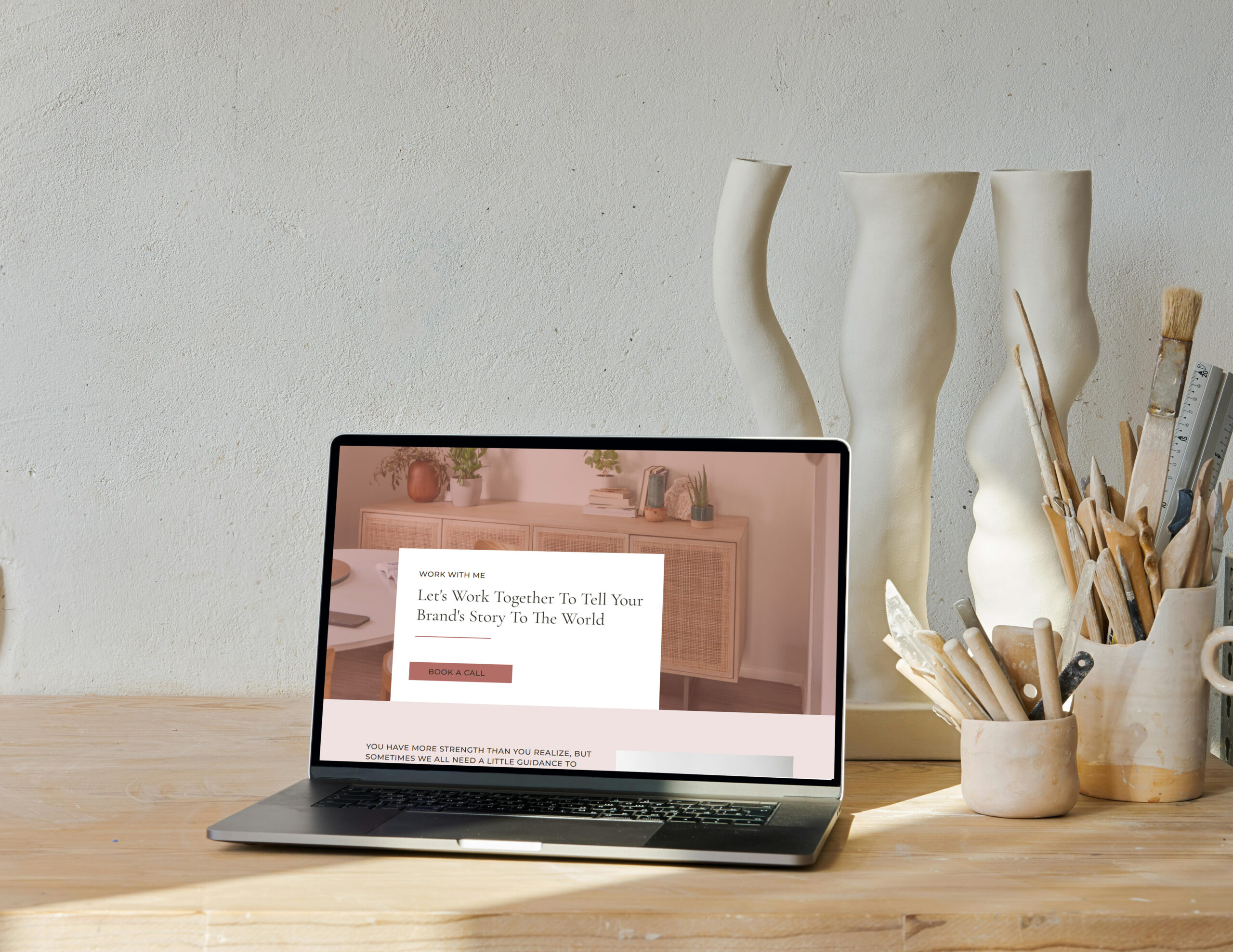
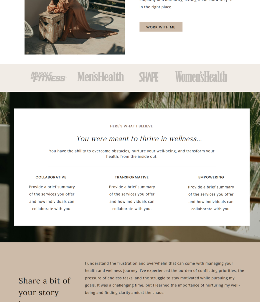
5. The Single-Page Scrolling Layout
Rather than breaking content into multiple pages, the Single-Page Scrolling Layout tells a seamless, flowing story as visitors scroll down. It’s ideal for brands that want to create an immersive, engaging experience.
Why it works: This layout guides visitors through a journey, unveiling new sections as they scroll. It’s great for sales pages, brand storytelling, or simplified websites.
Pro tip: Use subtle animations or parallax effects to add depth and movement—just enough to enhance the experience without distracting from your message.
How to Choose the Right Layout for Your Brand
Each of these layouts is designed to optimize user experience and drive conversions—but the best one for you depends on your brand, audience, and goals.
Ask yourself:
- What is the main action I want visitors to take?
- Do I need to showcase a single offer (Hero Layout) or multiple options (Card-Based Layout)?
- Is my content text-heavy (F-Pattern) or visual-driven (Z-Pattern)?
- Do I want a simple, flowing narrative (Single-Page Scrolling)?
Remember, the right layout isn’t just about aesthetics—it’s about making your visitors’ journey as clear, engaging, and impactful as possible.
Your Website Is More Than a Design—It’s a Reflection of Your Brand
A high-converting website isn’t just about choosing the right layout. It’s about creating an experience that aligns with your mission, speaks to your audience, and builds trust.
- Is your brand identity clear and cohesive?
- Are your colors, fonts, and imagery working together seamlessly?
- Does your website feel like a true reflection of your purpose?
If you’re still figuring that out, we’ve got just the thing for you! 🎉
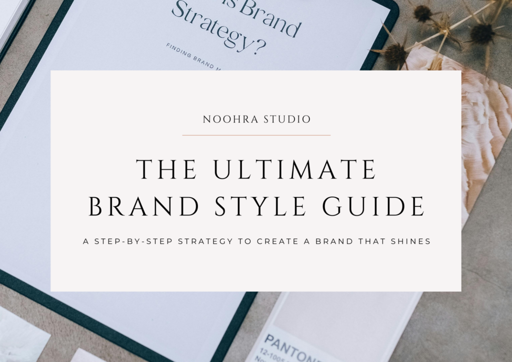
Download Noohra Studio’s FREE Ultimate Brand Style Guide—a step-by-step resource to help you build a beautiful, conversion-friendly brand identity.
Your website is a powerful tool to serve, inspire, and grow. Let’s make sure it’s working for you—so your visitors don’t just browse… they believe, engage, and take action.
Here’s to a website that shines! ✨