
Finding Your Signature Brand Colors: A Journey to a Radiant Brand Identity
Your brand is more than a logo or a website—it’s a calling, a purpose, a message that deserves to shine. And just like a sunrise paints the sky with color, the right brand colors can illuminate your mission and connect deeply with your audience.
So, let’s embark on a colorful journey to discovering your signature brand palette—one that reflects your essence, your heart, and the impact you’re meant to make.
Why Do Brand Colors Matter?
Color isn’t just decoration—it’s communication. It has the power to evoke emotions, create recognition, and tell a story before a single word is spoken.
Think of your brand colors as the visual expression of your voice—the first impression that welcomes your audience and reassures them, “You’re in the right place.”
When chosen intentionally, your brand colors can:
✅ Strengthen your brand identity and make you instantly recognizable
✅ Evoke the right emotions to resonate with your audience
✅ Differentiate you from the sea of competitors
✅ Create consistency across your website, social media, and marketing materials
Let’s uncover the hues that will bring your brand to life! 🎨✨
The Psychology of Color: What Do Colors Say About Your Brand?
Every color carries meaning—whether we realize it or not. Choosing the right shades ensures your brand aligns with the feelings you want to inspire.
💖 Red → Passion, energy, urgency
💙 Blue → Trust, calm, professionalism
💛 Yellow → Joy, optimism, warmth
💚 Green → Growth, balance, nature
💜 Purple → Creativity, luxury, spirituality
🧡 Orange → Confidence, enthusiasm, adventure
💗 Pink → Playfulness, compassion, femininity
🤎 Brown → Stability, reliability, earthiness
🖤 Black → Elegance, power, sophistication
🤍 White → Purity, simplicity, clarity

What emotions do you want to evoke when people see your brand? Let’s find your perfect palette. 🎨
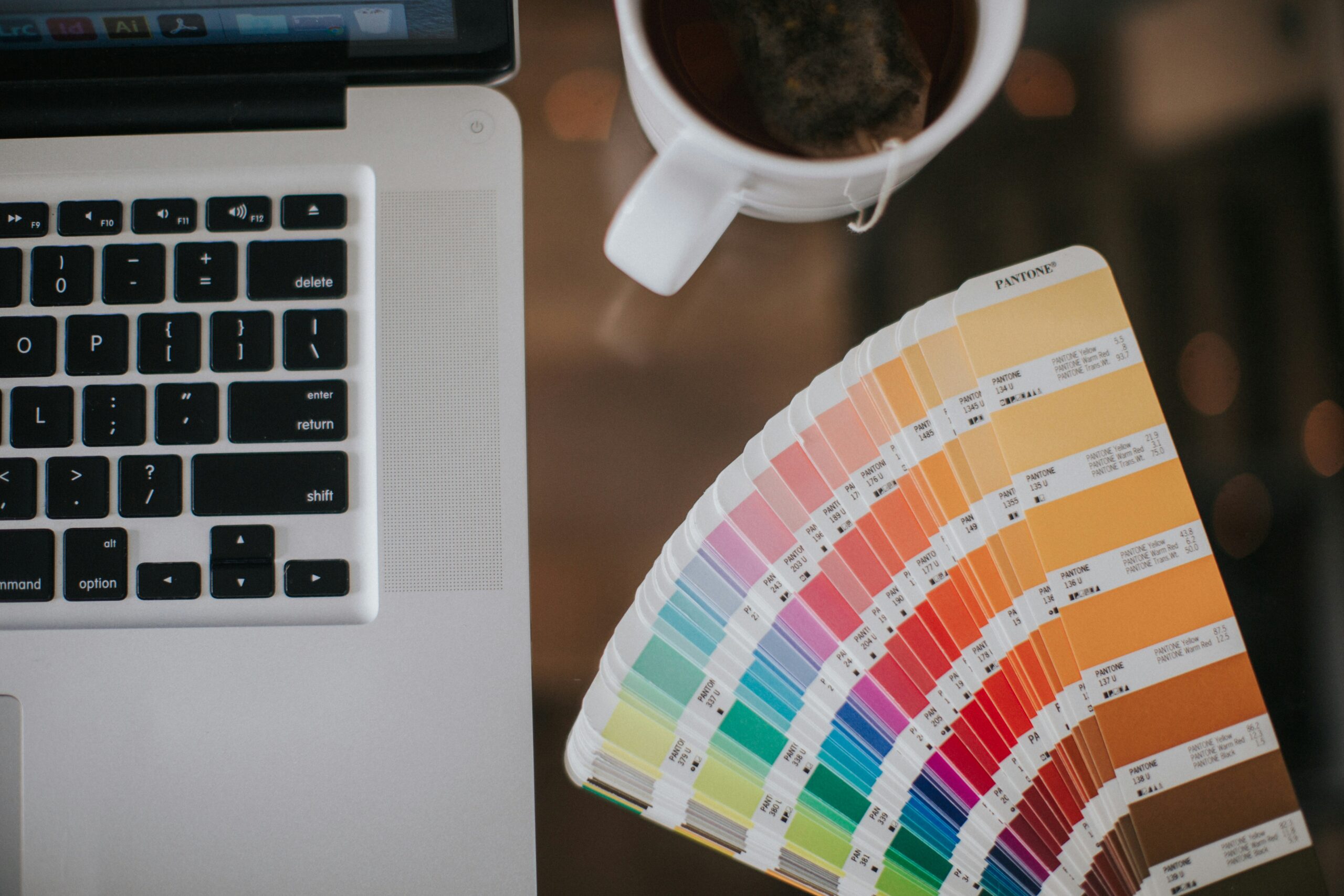
How to Choose Your Signature Brand Colors
1. Reflect on Your Brand’s Personality
Is your brand bold and dynamic or calm and nurturing? Luxurious and refined or playful and inviting?
Your colors should visually reflect your brand’s soul. If your mission is all about uplifting and inspiring, warm hues like gold, peach, or coral might be a great fit. If you want to convey peace and trust, soft blues and sage greens might be the way to go.
2. Understand Your Audience
Who are you serving? Different colors appeal to different people.
✨ Energetic audiences → Bright, vibrant colors
✨ Refined audiences → Muted, elegant tones
✨ Natural brands → Earthy greens, browns, or neutrals
3. Stand Out from Your Competitors
Take a peek at others in your industry. If everyone is using blue, maybe a warm terracotta or a deep plum will set you apart. Dare to be different—but stay true to your brand’s heart.
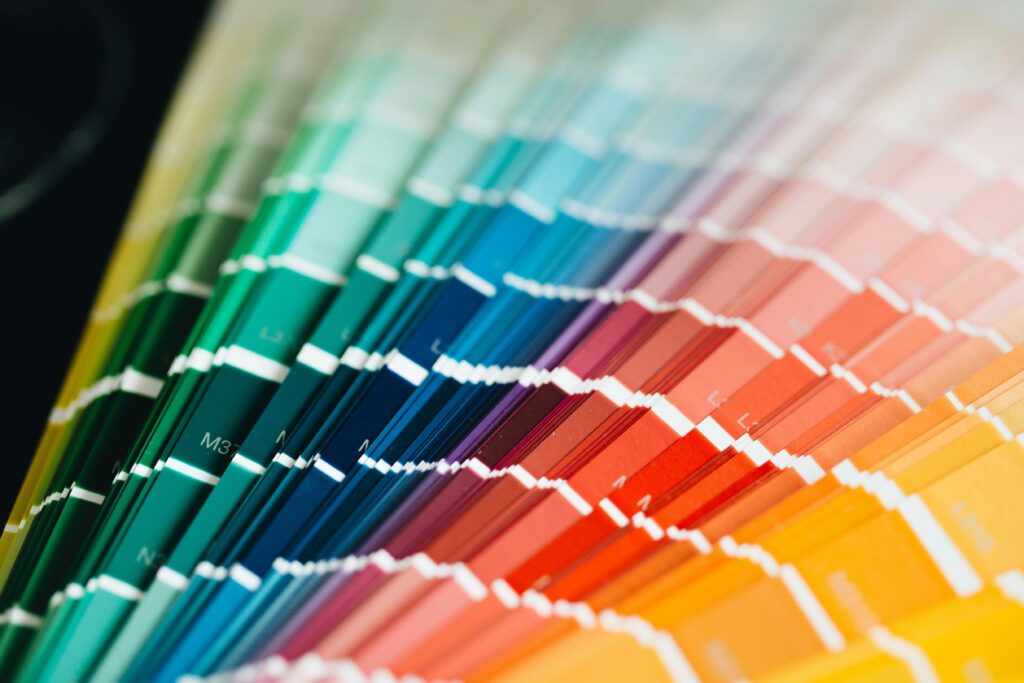
4. Use Color Theory for Harmony & Impact
A great color palette has balance and intention. Here’s a simple guide:
🎨 Complementary Colors → Opposites on the color wheel, creating contrast (e.g., blue & orange)
🎨 Analogous Colors → Side by side, creating harmony (e.g., teal, blue, and lavender)
🎨 Monochromatic Colors → Different shades of the same color for a refined look
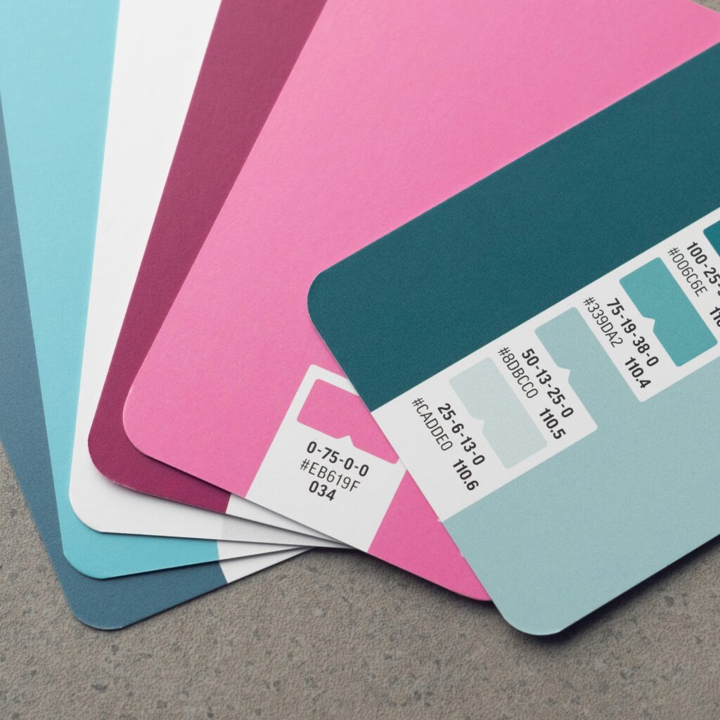
5. Test & Refine Your Palette
Try out different combinations and see how they feel across your website, graphics, and social media. Gather feedback, tweak as needed, and trust your instincts—your perfect palette will feel just right when you find it.
Bringing Your Brand Colors to Life
Once you’ve found your colors, it’s time to use them intentionally! Here’s how to make them work for you:
🌟 Create a Color Hierarchy → Choose a primary color (your main brand color), secondary colors (to support it), and an accent color (for contrast & attention).
🌟 Use Color to Direct Attention → Make your Call-to-Action buttons stand out with a bold color that naturally draws the eye.
🌟 Ensure Readability → Pair light text with dark backgrounds and vice versa for easy readability.
🌟 Stay Consistent → Use your colors across all platforms—your website, Instagram, email templates, packaging—to create instant recognition.
🌟 Think About Accessibility → Some visitors may have color blindness. Make sure your color combinations are easy to read by using contrast checkers.
🌟 Embrace White Space → You don’t have to use every color all the time. Clean, airy designs with intentional pops of color create a sophisticated, high-end feel.

Your colors are more than just aesthetic—they’re here to make an impact. Your colors should speak to the hearts of those you’re meant to serve, so embrace your signature palette, and let your brand radiate with purpose, authenticity, and beauty.
Ready to Build a Cohesive, Beautiful Brand?
We’ve got a special gift for you!
Download Noohra Studio’s FREE Ultimate Brand Style Guide!
This comprehensive guide walks you through every step of creating a visually cohesive brand, from choosing the right colors to defining your brand voice.


