
5 Website Design Mistakes That Could Be Holding You Back (And How to Fix Them!)
Your website isn’t just a digital space—it’s your brand’s first impression, your message, and your invitation to connect. But even with the best intentions, some common design mistakes might be turning visitors away instead of drawing them in. No worries—we’ve got you covered. Here are five website design mistakes that could be hurting your business, plus simple fixes to turn things around.
1. A Cluttered & Overwhelming Design
Imagine walking into a room filled with too many colors, fonts, and flashing buttons—it’s overwhelming, right? A cluttered website makes it hard for visitors to focus on what truly matters.
The Fix: Embrace white space and give your content room to breathe. Stick to two or three complementary colors for a polished, professional look. Use clear, readable fonts—every heading doesn’t need a different style.
2. Slow Loading Times
In a fast-paced world, a slow website is an instant dealbreaker. If your site takes more than a few seconds to load, visitors are likely hitting the back button before they even see your content.
The Fix: Optimize your images by compressing them without losing quality. Use a content delivery network (CDN) to improve speed globally. Minimize unnecessary plugins and scripts slowing things down.
3. Poor Mobile Responsiveness
With most people browsing on their phones and tablets, a website that isn’t mobile-friendly is missing out on a huge audience. If visitors have to zoom in, scroll sideways, or struggle to click a button, chances are they won’t stick around.
The Fix: Use a responsive design that adapts to any screen size. Make buttons and links easy to tap—no tiny text. Test your site on multiple devices to ensure a seamless experience.
4. Confusing Navigation
Ever landed on a website and had no idea where to click next? A confusing menu or disorganized layout makes visitors frustrated—and when they’re frustrated, they leave.
The Fix: Keep your navigation simple and intuitive. Use clear labels so visitors instantly know where to go. Organize content logically and guide them on a smooth journey.
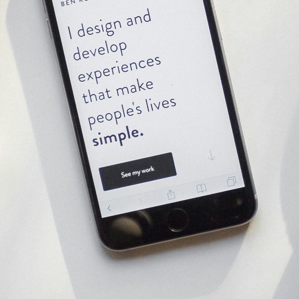
5. Weak or Missing Call-to-Action
You’ve brought visitors to your site—amazing. But if they don’t know what to do next, they’ll leave without taking action. A weak or missing CTA is like inviting guests to a party but forgetting to tell them where it is.
The Fix: Make your CTA stand out using bold colors and high contrast. Use action-driven language—”Get Started Today” instead of “Click Here.” Repeat your CTA strategically throughout your page.
Keep It Consistent
Your website is an extension of your brand identity. Consistent colors, fonts, and messaging build trust and recognition—helping visitors feel more connected to your brand.
Want to take your branding to the next level? Download Noohra Studio’s free Ultimate Brand Style Guide. This comprehensive guide will help you create a cohesive brand identity that shines through your website, choose the perfect colors, fonts, and design elements for your business, and align your website with your mission and message for maximum impact.

Your Website, Your Impact
Your website isn’t just about looks—it’s about connection, clarity, and conversions. By fixing these common design mistakes, you’ll create a site that attracts, engages, and inspires your audience.
Take a fresh look at your website. Are any of these mistakes holding you back? If so, now’s the time to make simple, effective changes—your visitors and your business will thank you for it. Get ready to build a website that not only looks beautiful but works beautifully too.


