
5 Simple Steps to Create a Brand Color Palette That Feels Authentically You
Are you ready to dive into the vibrant world of brand color palettes? Let’s embark on a journey to create a palette that not only looks stunning but also feels true to your brand’s essence.
Step 1: Find Your Brand’s Personality
Before we start playing with colors, let’s get to know your brand on a deeper level. Imagine your brand as a person – what’s their vibe? Are they bold and energetic, or calm and sophisticated? Maybe they’re quirky and playful, or perhaps they exude elegance and luxury. This deep-dive exercise is crucial because your brand’s personality will be the compass guiding your color choices.
Pro tip: Jot down 3-5 adjectives that best describe your brand’s personality. These will be your North Star throughout the color selection process.

Step 2: Explore Color Psychology
Now that you’ve got a handle on your brand’s personality, it’s time to dive into the fascinating world of color psychology. Colors aren’t just pretty to look at – they speak volumes without saying a word! Each hue carries its own set of emotions and associations:
- Red: Passion, energy, excitement
- Blue: Trust, calm, stability
- Yellow: Optimism, creativity, warmth
- Green: Growth, nature, harmony
- Purple: Luxury, creativity, wisdom
- Orange: Enthusiasm, adventure, confidence
Think about which colors align with your brand’s personality and the emotions you want to evoke in your audience. This step is where the fun begins to happen!

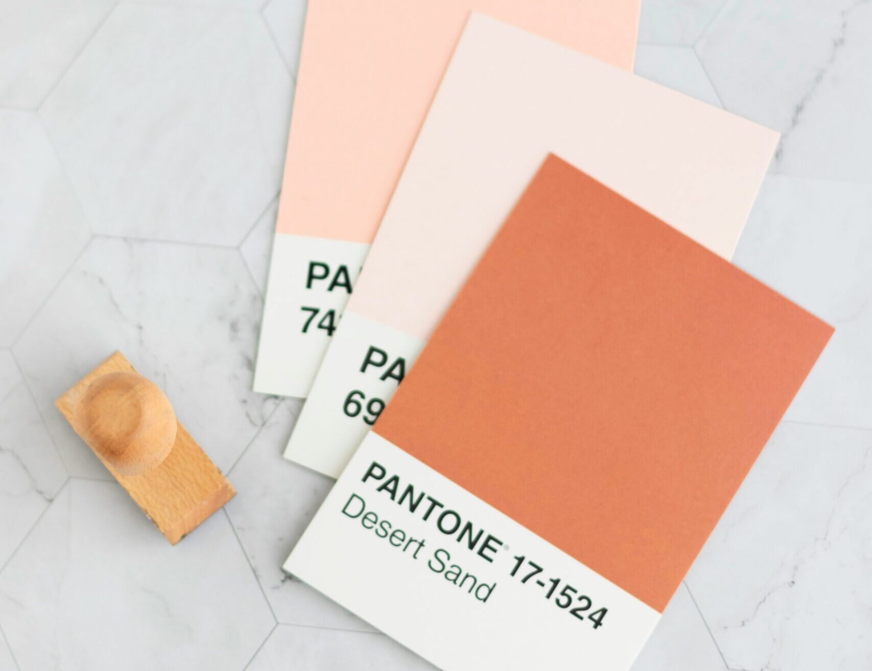
Step 3: Create Your Core Color Palette
It’s time to roll up your sleeves and start picking colors! Your core palette typically consists of 1-3 main colors that will be the stars of your brand’s show. These colors should strongly reflect your brand’s personality and the emotions you want to convey.
Start with your dominant color – this will be the hero of your palette and the one you’ll use most often. Then, choose 1-2 supporting colors that complement your dominant color and add depth to your palette.
Remember, less is often more when it comes to core colors. You want a palette that’s versatile and easy to work with across various applications.
Step 4: Add Accent Colors for Flair
Now that you’ve got your core colors nailed down, let’s add some pizzazz with accent colors! These are the supporting actors in your color story – they add visual interest and help create contrast in your designs.
Choose 2-4 accent colors that play well with your core palette. These could be lighter or darker shades of your core colors, or completely different hues that add a pop of unexpected color.
Pro tip: Use the 60-30-10 rule as a starting point. Your dominant color should occupy about 60% of your design, your secondary color 30%, and your accent color(s) the remaining 10%.

Step 5: Test and Refine Your Palette
Congratulations, you’ve created your brand color palette! But before it takes center stage, it’s important to make sure it not only looks great, but also performs well in the real world.
Test your colors across different applications – your website, social media graphics, business cards, and any other brand touchpoints. Make sure they work well together in various combinations and are legible when used for text.
Don’t be afraid to make adjustments. Your brand color palette is a living entity that can evolve as your brand grows. The key is to maintain consistency while allowing for flexibility.

Ready to take your brand to the next level?
Creating a brand color palette is just one piece of the brand identity puzzle. If you’re ready to dive deeper and create a truly cohesive brand identity, we’ve got a treat for you!
Download our free Ultimate Brand Style Guide and unlock the secrets to building a brand that stands out from the crowd. This comprehensive guide will walk you through every aspect of creating a memorable brand identity, from defining your brand values to choosing the perfect typography.
Don’t leave your brand’s success to chance. Grab your free Ultimate Brand Style Guide now and start building a brand that truly reflects your unique vision and values. Your future clients are waiting to fall in love with the authentic, colorful you!
Remember, your brand color palette is more than just a pretty face – it’s the visual language that communicates your brand’s personality to the world. So have fun with the process, trust your instincts, and create a palette that feels authentically, undeniably you!


